

The 9 Elements Every Aesthetic Practice Needs (and the 3 You Should Avoid at All Costs)
Dear Practice Owner,
I’m about to tell you something that might sound impossible.
Your landing page — the one that’s been quietly sitting there, doing its best, minding its own business — could start booking more appointments automatically, without new ads, without a new website, and without learning another marketing trend that burns out faster than a lip flip on TikTok.
In fact, once you make a few simple changes I’m about to share, you may be surprised to see:
- More inquiries from patients who actually read your information
- Fewer no-shows
- More prepaid bookings
- And a calmer, more confident front desk (because they’re no longer trying to “fill in the gaps” your website left behind)
Yes, things can get that much better.
But before we go any further, let me be honest with you…
There is a downside.
If you follow this blueprint, your landing page may start performing so well that you’ll need to update your scheduling system, refine your treatment plan flow, or even add another injector or aesthetician to keep up.
But I don’t think you’ll mind one bit.
Because once the right patients begin flowing in — the ones who understand your value, respect your expertise, and walk in already knowing what they want — something remarkable happens in your practice.
Suddenly your schedule feels lighter even when it’s full. Your consultations feel smoother. Your revenue feels steadier. Your team feels sharper.
Picture this for a moment…
It’s a random Tuesday. You’re sipping your coffee. You open your schedule — and the appointments are already filled with patients who know exactly what they’re coming in for, why they chose you, and what result they hope to achieve.
No friction. No convincing. Just aligned expectations and ready-to-move-forward patients.
This is the power of a landing page that books itself.
But it wasn’t always this way.
How I Discovered the 9 Elements (The Story You Won’t Find in Any Marketing Course)
A few years ago, when I started quietly studying why some aesthetic practices were booked solid while others struggled, I expected to see obvious patterns.
Better devices? Bigger ad budgets? Flashier branding? Celebrity injectors?
Nope.
What I found instead was something almost embarrassingly simple:
The top-performing practices had landing pages that followed the exact same structure — even though none of them knew each other.
And the lower-performing practices?
They were all missing the same pieces.
Nine, to be exact.
The same nine I’m going to hand you today.
But before I give you the full list, let me tell you how this discovery really hit me.
The Day the Lightbulb Went On
I was reviewing two practices’ landing pages back-to-back.
Both had:
- Excellent credentials
- Strong local reputations
- Skilled injectors
- High-value devices
- Solid social media traction
But only one was consistently booked out for 6–10 weeks.
And the other? They were running discounted packages just to keep the calendar respectable.
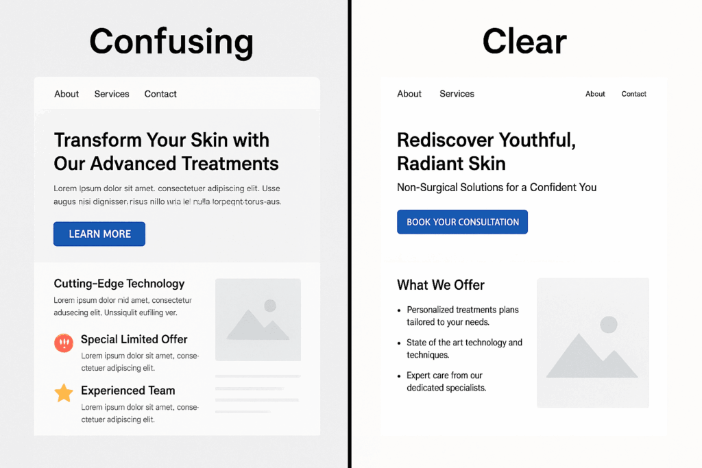
The difference wasn’t quality. It wasn’t talent. It wasn’t even results.
It was the landing page.
One page made the patient feel instantly understood. The other made the patient feel like they had homework.
One page guided the reader calmly from curiosity to confidence. The other assumed the reader already knew everything.
One page gave clarity. The other created uncertainty.
And we both know what uncertainty creates in aesthetics:
No action.
This realization was so striking that I spent the next year reverse-engineering landing pages from:
- High-performing dermatology practices
- Busy med spas
- Concierge-style aesthetic clinics
- Plastic surgeons with waitlists
And once I mapped everything out, the pattern was undeniable.
The Origin of the 9 Elements (The Part Most Consultants Never Tell You)
You won’t find these in marketing textbooks. They’re not from Google. They’re not from ad agencies.
They come from patient psychology — real behavior observed in real aesthetic practices.
These nine elements weren’t created by marketers.
They were created by patients.
Because when you follow them, you’re not just designing a landing page…
You’re restoring emotional safety. You’re reducing cognitive load. You’re simplifying decisions. You’re building trust faster than a consultation ever could.
And once these pieces are in place, something truly beautiful happens:
The landing page begins to work with you — automatically — instead of against you.
Just ask the practices who started implementing this framework.
“We didn’t get more traffic. We just started converting the traffic we already had.”
— Medical Director, Plastic Surgery Practice, Chicago
“Our consults feel calmer now. Patients show up informed instead of overwhelmed.”
— Lead NP Injector, Scottsdale
“We finally stopped explaining the same things over and over on the phone.”
— Front Desk Manager, Houston Med Spa
Not hype. Not magic.
Just clarity doing its job.
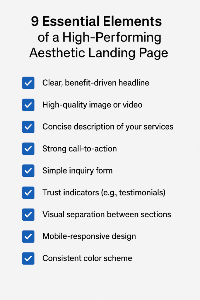
The 9 Elements Every Aesthetic Landing Page Needs
And now — the part you came for.
Here they are, in the order that earns patient trust and sparks action:
- A headline that mirrors the patient’s desire, not the treatment name
- A subheadline that confirms they’re in the right place
- A short, human value proposition explaining what results they can expect
- Real social proof that feels like real people, not staged perfection
- Before-and-after photos with honest context, not a guessing game
- A “What to Expect” section that calms anxiety and restores control
- Transparent pricing or a price range to eliminate financial fear
- A soft, personal call-to-action — no pressure, just guidance
- A friendly FAQ that removes the last remaining doubts
Together, these nine elements create something powerful:
Not a landing page…
…but a decision-making experience.
One that respects patients, reduces friction, and guides them—step by confident step—to booking.
But before you run off to add these elements, let me warn you:
Even the best landing page will fall apart if you include the next three things.
The 3 Elements You Must Avoid at All Costs
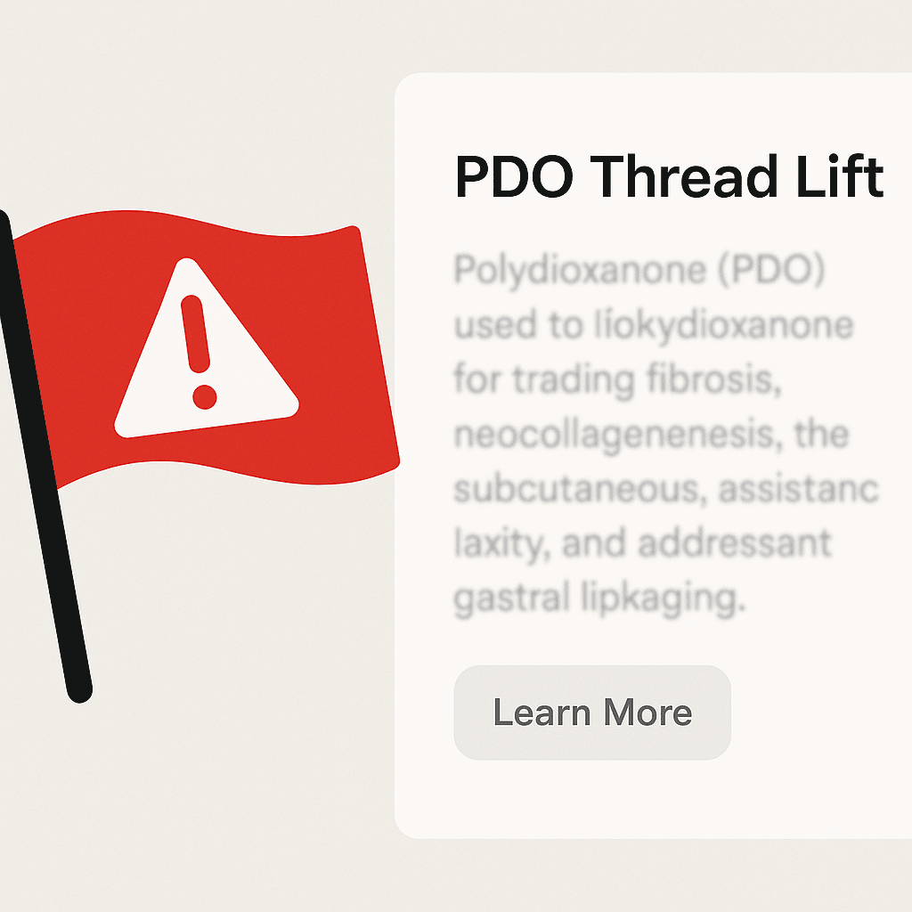
1. Walls of scientific jargon
Patients don’t want a graduate degree. They want clarity.
2. Stock images of models who look like no one in your practice
Patients trust what feels real.
3. A single lonely CTA button
You need more than one door if you want people to walk through.
Avoid these, and your page stays strong.
Let’s Bring This Home
If you follow these nine elements — and remove the three really big mistakes — your landing page will start working like a silent engine in your practice.
Not loud. Not flashy. Just steady and reliable.
A landing page that guides. A landing page that reassures. A landing page that books itself.
And you, my friend, deserve a website that carries its weight.
If you want help identifying the clarity gaps on your current page — or you’d like an expert pair of eyes to rebuild the messaging with you…
👇 Click here for the link to book a friendly, pressure-free assessment.
Your next patient is already looking for you. Let’s make sure your landing page says exactly what they need to hear.
Beautifully written and incredibly insightful breakdown of what makes an aesthetic landing page convert.